Apple's bento grid playbook, four keynote decks compared
Apple didn't invent the bento grid. After the September 2022 keynote, every B2B landing page started looking like one. Two years later most of them still don't work, and lining up four Apple keynote decks back-to-back is a useful way to see why. The format isn't a layout. It's a discipline.
We already covered Apple's bento layout in detail on a single deck. This is the comparison piece. Four decks, two years, one pattern — and a real shift between them.
The four decks
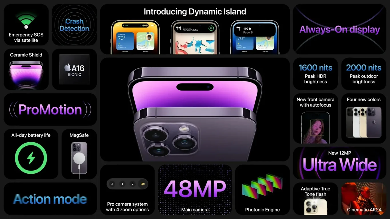
- Apple Event Product Summary 2022 — 9 slides. AirPods Pro, Watch Series 8, Watch Ultra, iPhone 14 Pro.
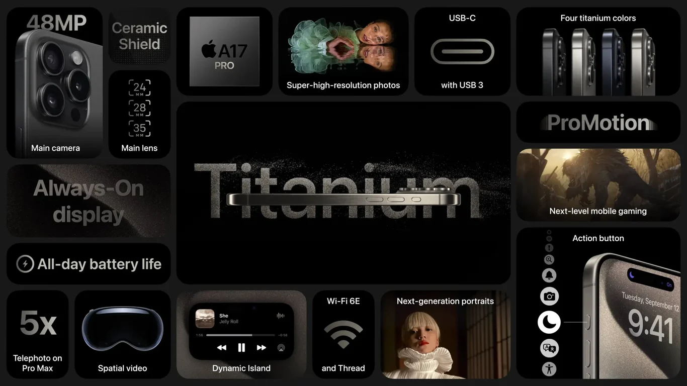
- Apple Event Product Summary 2023 — 4 slides. iPhone 15/Pro, Watch Series 9.
- WWDC 22 Keynote Product Highlights — 7 slides. watchOS, iPadOS, iOS 16, M2.
- WWDC 23 Keynote Product Highlights — 8 slides. watchOS, iPadOS, macOS, M2 Ultra.
All four sit in the marketing category. Same brand, same designers, same format, same constraints.
What the bento grid actually does
A bento slide is a grid of unequal tiles. Each tile is a self-contained fact — a chip, a sensor, a battery rating, a feature. The tiles don't queue up like a list, and they don't compete like columns. They sit side by side at different sizes, and the size hierarchy does the editorial work that bullet points usually fail at.
The pattern works because it answers a problem most product slides have: too much information, no obvious priority. A normal "iPhone 14 Pro features" slide is a wall of bullets the audience reads in roughly the order they appear. A bento version of the same slide says, with the size of the largest tile, "this one matters most." Then the smaller tiles supply context without demanding equal attention.
Across all four decks, the largest tile is always the photographed product. The smallest tiles carry numbers and abbreviations — chip names, screen sizes, battery hours. That's the real rule.
Tile hierarchy is the actual pattern
Look at the iPhone 14 Pro slide and the iPhone 15 Pro slide next to each other. Different products, different year, identical structure: one large product photograph, one large feature label, three or four small tiles for specs.
WWDC follows the same template but for software. The iOS 16 slide and the iPadOS 17 slide both use the largest tile for a screen mockup, smaller tiles for individual features. The hierarchy holds whether the hero is a photograph or a UI screenshot. The pattern is rigid; the content varies.
What changed between 2022 and 2023
The Sept 2022 deck has nine slides for one event. The Sept 2023 deck has four. Same number of major products. Same kind of audience. The compression isn't a redesign — it's an editorial decision to consolidate.
In 2022, sustainability gets two dedicated slides — one early, one late. By 2023 that content is folded into the product slides themselves (see the iPhone 15 slide, where "100% recycled cobalt battery" appears as a small tile next to the camera specs). The choice is interesting: 2022 frames sustainability as an Apple-level commitment that earns its own page; 2023 frames it as a product-level fact that lives next to the chip and the cameras.
The other shift is photo-to-text ratio. WWDC 22 has a dense M2 chip slide where most tiles carry numbers. WWDC 23's M2 Ultra equivalent reads similarly, but with more breathing room and fewer tiles trying to be the hero.
What works across all four
- Visual consistency without copy-pasting layouts. No two slides have the same tile arrangement. They share size logic, not pixel logic.
- Specs without bullet lists. Every spec is a tile. A tile carries one fact. Reading is glanceable, not sequential.
- Photography at the largest tile. When the hero is a product photo (Apple has the resources) it does most of the slide's emotional work, and the spec tiles around it become annotations rather than copy.
- Whitespace as a material. Between tiles, around tiles, inside tiles. The grid breathes because the gaps are deliberate, not residual.
Where the bento format fails
For decks that copy this layout without the underlying conditions, the result is an empty wall. Three things have to be true for the format to land:
- You have product-grade hero imagery. A bento slide built on stock photos or Figma mockups looks lifeless. The photograph is doing the heaviest lift.
- You have facts that are short enough to be tiles. "Sub-100ms" fits. "Cuts onboarding time by 47%" fits. A two-clause feature description does not — it overflows the tile and breaks the hierarchy.
- You have a clear largest fact. The bento format is a hierarchy in geometric form. Without one fact that earns the biggest tile, every tile competes and the slide goes flat.
If a deck is missing any of those, the bento layout is the wrong solution. The pattern doesn't generate priority on its own — it expresses a priority you already have.
Takeaway
The interesting decks here are not 2022 and 2023 — they're the gap between them. Apple kept the format and shed the slides. Nine became four for the product summary. Sustainability became a tile. The takeaway isn't "use bento grids." It's that a working bento deck reveals the editorial work of deciding what a product is, before any layout exists. The grid surfaces that decision; it doesn't make it.
Read next: the single-deck breakdown of the Sept 22 keynote, which goes tile-by-tile on one deck, or browse the rest of the marketing category for non-Apple bento attempts.